Tenna Live Data
I took on this interest project after receiving constructive feedback about the product experience.
Research
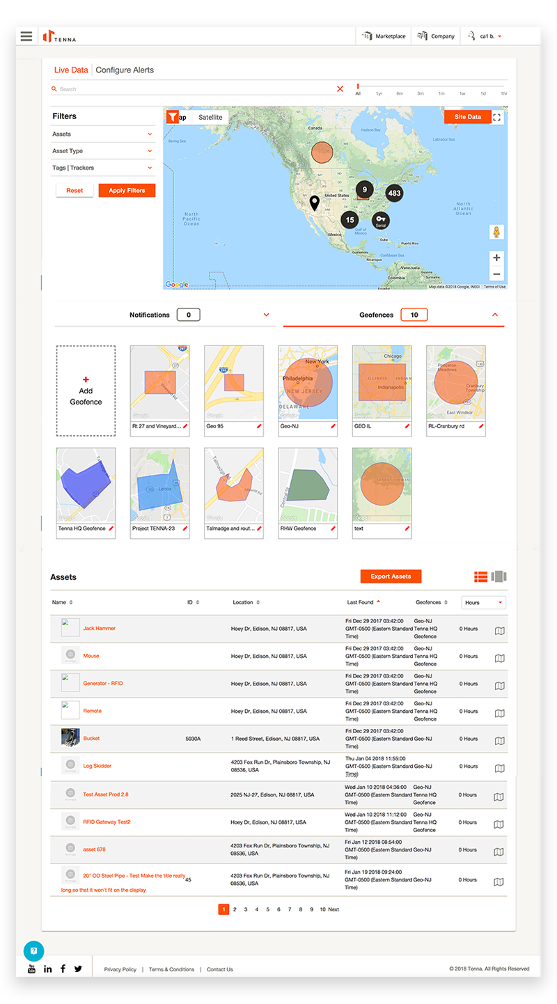
The existing solution was powerful but under-utilized due to its’ poor experience. In order to attract new clients and satisfy the needs of current clients, we redesigned the solution with users in mind.
The solution lacked direction, which caused confusion among users trying to gather information needed to execute their daily duties. Our customer success reps and user interviews, provided valuable insight into the struggles our users’ faced.
 .
.
Wireframes
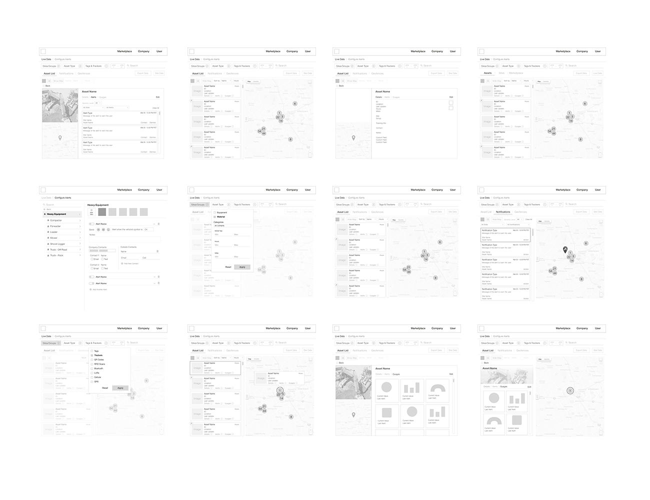
The goal of the new design had usability at its forefront. By eliminating unnecessary fields and information, adjusting the layout, and simplifying the user interface, clients were exposed solely to what they needed. This allowed them to retrieve data quickly and efficiently.
.
Mockups
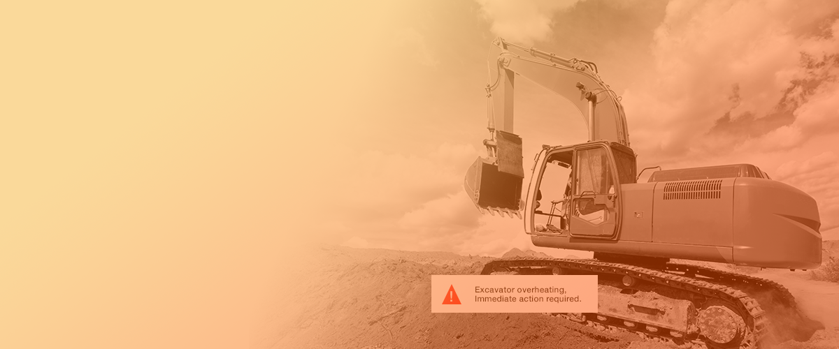
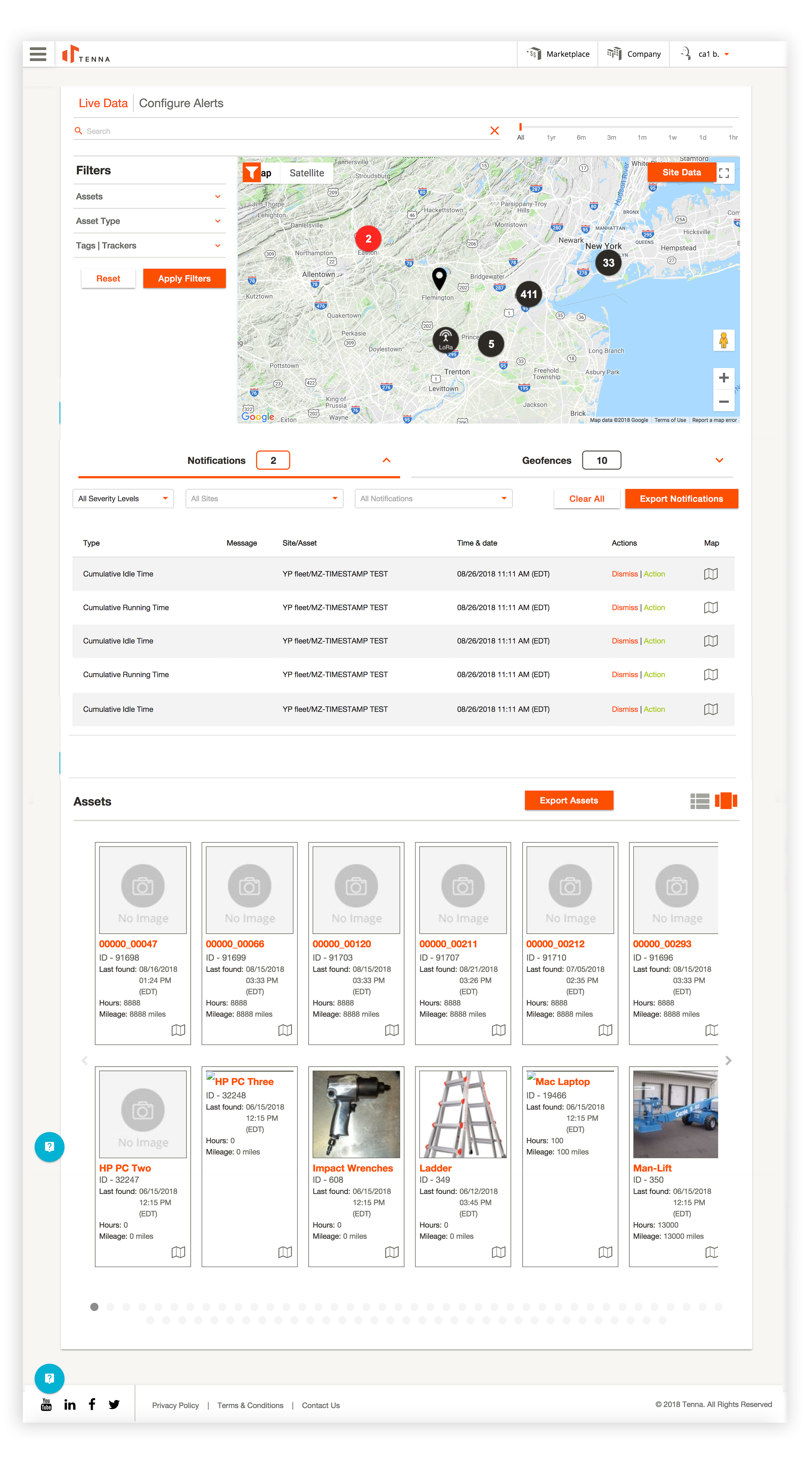
Some alerts notify users of asset- and life-threatening issues. The severity of these scenarios needed to be represented in such a way that both the operator and his/her supervisor could take immediate action to resolve the problem.
 .
.
Prototypes
Because we were doing a redesign we knew rejection was coming. Beta testing with exisiting users really showed us that we were headed in the right direction. Once the users learned the new layout, they really saw the value in the re-design.
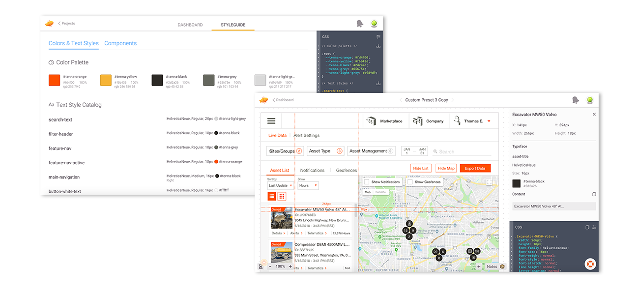
I created an in-depth zeplin guide for developers to start a global styleguide we could use across the entire site.
Previous Project