IEEE μVolunteering

As the product designer, I worked with client stake holders, project manager, and a team of developers to build the product in a waterfall process.


Time Frame: 4 Weeks

My Role: Product Designer


The Challenge


Our team was commissioned by IEEE, the global professional hub for the engineering and technology community, to enhance their current μVolunteering web application. Designed for aspiring young professionals seeking career advancement, skill acquisition, and mentorship in their respective industries, the platform aims to connect users with volunteer opportunities.

The primary objectives set by stakeholders were to boost user registration and application rates for posted volunteer positions on μVolunteering. Additionally, there was a focus on improving user retention, as a significant number of participants were engaging in only one opportunity.

.


The Before


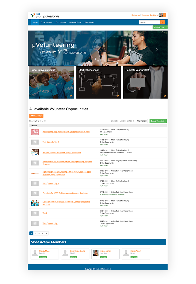
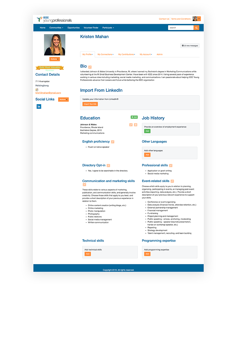
Upon initial inspection, it was evident that the product required a revitalization. According to Jakob's UX law, users generally prefer products to function similarly to other familiar websites. The website appeared outdated and antiquated, a significant concern given its target demographic of younger generations. It was essential for the site to exude a modern and fresh feel to resonate with its intended audience.

First slide


First slide .


We interviewed college students to gain insight...

The initial application proved to be overly cumbersome, eliciting complaints from users about its complexity, bulkiness, and subpar user experience both within and outside the product. Moreover, users were dissatisfied, especially when they didn't see the immediate monetary gain from applying to opportunities.

Another challenge was to communicate the inherent value of volunteering to users. Many of these opportunities contribute to resume building, mentorship acquisition, and networking within the industry. Emphasizing that volunteering serves as a valuable stepping stone for college students, offering crucial experience and positioning users for success when seeking full-time positions, was essential.

.


Building MVP


Wireframes

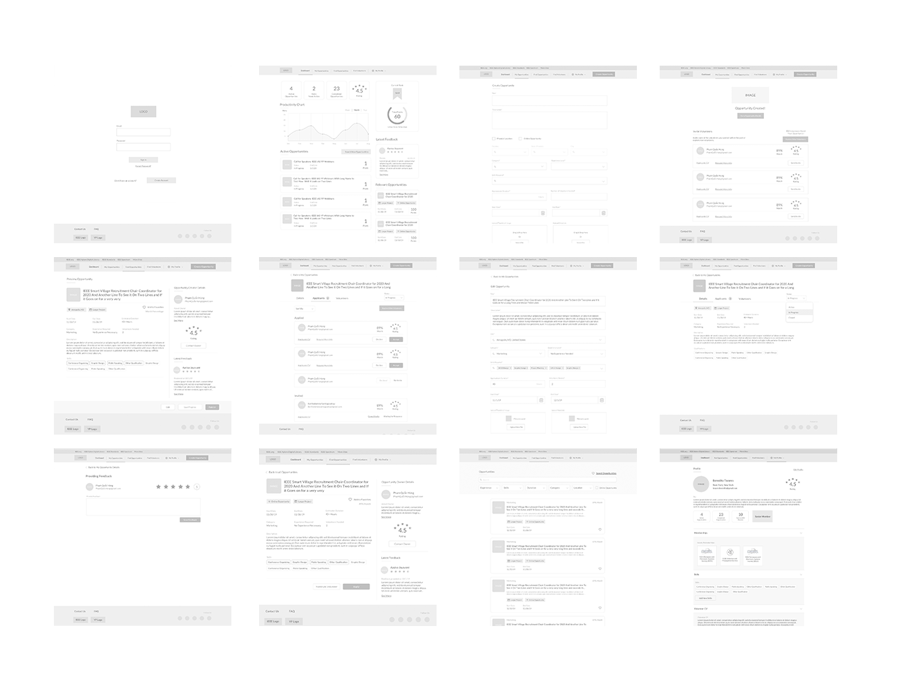
We generated low-fidelity wireframes to guide stakeholders through the revamped process and user experience.

Considering the users' initial feedback, our aim was to maintain simplicity and user-friendliness in the redesigned screens, introducing a new and improved experience. Emphasizing the product's value and highlighting reasons for college students to engage with opportunities were key objectives. To enhance motivation and retention, we incorporated gamification elements into the design.
First slide


High Fidelity Mocks

Our goal was to maintain a clean and straightforward interface. We minimized the use of color to facilitate easy navigation for the user, ensuring that they can quickly identify the focal point of the page.

First slide

.


Hand Off


Design System

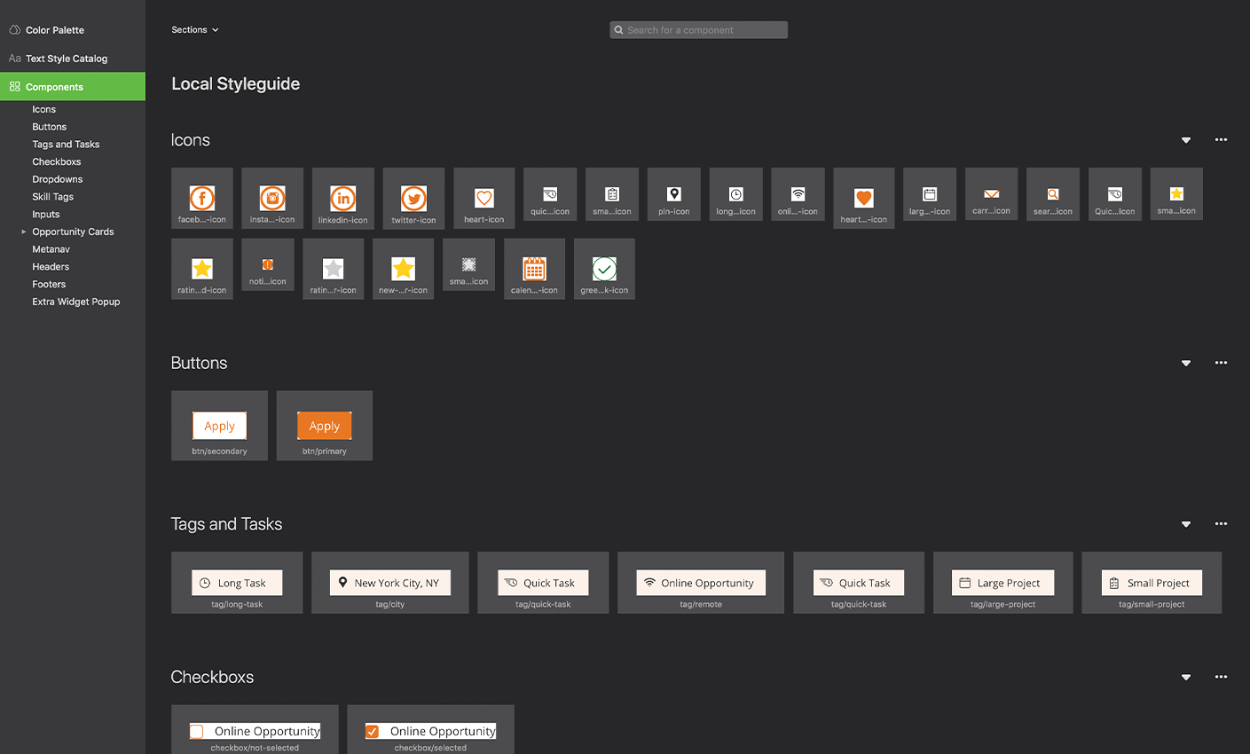
We established a design system for IEEE to adhere to, enabling swift implementation. Following the conclusion of our contract, IEEE could seamlessly engage internal or external designers to continue working on and iterating the product.
First slide


Interaction Design

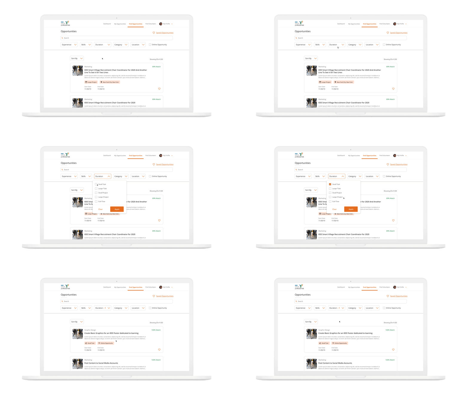
We incorporated micro-animations to infuse a contemporary touch into the product, enhancing its visual appeal. These subtle animations not only made the interface more attractive but also offered users additional context as they navigated through the product, providing visual cues with each interaction.
First slide


IEEE μVolunteering

As the product designer, I worked with client stake holders, project manager, and a team of developers to build the product in a waterfall process.


Time Frame: 4 Weeks

My Role: Product Designer


The Challenge


Our team was commissioned by IEEE, the global professional hub for the engineering and technology community, to enhance their current μVolunteering web application. Designed for aspiring young professionals seeking career advancement, skill acquisition, and mentorship in their respective industries, the platform aims to connect users with volunteer opportunities.

The primary objectives set by stakeholders were to boost user registration and application rates for posted volunteer positions on μVolunteering. Additionally, there was a focus on improving user retention, as a significant number of participants were engaging in only one opportunity.


The Before


Upon initial inspection, it was evident that the product required a revitalization. According to Jakob's UX law, users generally prefer products to function similarly to other familiar websites. The website appeared outdated and antiquated, a significant concern given its target demographic of younger generations. It was essential for the site to exude a modern and fresh feel to resonate with its intended audience.


First slide
First slide

.
We interviewed college students to gain insight...

The initial application proved to be overly cumbersome, eliciting complaints from users about its complexity, bulkiness, and subpar user experience both within and outside the product. Moreover, users were dissatisfied, especially when they didn't see the immediate monetary gain from applying to opportunities.

Another challenge was to communicate the inherent value of volunteering to users. Many of these opportunities contribute to resume building, mentorship acquisition, and networking within the industry. Emphasizing that volunteering serves as a valuable stepping stone for college students, offering crucial experience and positioning users for success when seeking full-time positions, was essential.


Building MVP


Wireframes

We generated low-fidelity wireframes to guide stakeholders through the revamped process and user experience.

Considering the users' initial feedback, our aim was to maintain simplicity and user-friendliness in the redesigned screens, introducing a new and improved experience. Emphasizing the product's value and highlighting reasons for college students to engage with opportunities were key objectives. To enhance motivation and retention, we incorporated gamification elements into the design.

First slide


High Fidelity Mocks

Our goal was to maintain a clean and straightforward interface. We minimized the use of color to facilitate easy navigation for the user, ensuring that they can quickly identify the focal point of the page.

First slide

.


Hand Off


Design System

We established a design system for IEEE to adhere to, enabling swift implementation. Following the conclusion of our contract, IEEE could seamlessly engage internal or external designers to continue working on and iterating the product.

First slide


Interaction Design

We incorporated micro-animations to infuse a contemporary touch into the product, enhancing its visual appeal. These subtle animations not only made the interface more attractive but also offered users additional context as they navigated through the product, providing visual cues with each interaction.

First slide


Previous Project Next Project